Phable × BubblyDeveloper tool branding / Visual identity
Bubbly
A bright personality.
A clear idea.
Make the unfamiliar
feel approachable.
Bubbly was an open-source release-readiness tool from Verifa. The branding challenge was to give a technical idea an approachable, recognisable personality within the developer tools ecosystem.
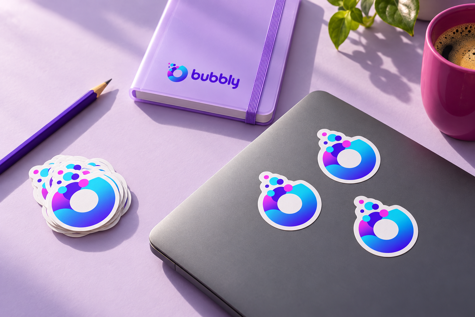
Phable began with a fact-finding workshop and stakeholder assessment, exploring more than a dozen logo concepts before refining the final identity. A rounded wordmark, a colourful bubble and an energetic palette made the name feel tangible.
Confirmed Phable work
Brand workshop and assessment · Logo exploration and refinement · Visual identity
This historical brand project is presented with new, labelled application concepts. The original software repository is now archived.
An expressive voiceFredoka / DM Sans / IBM Plex Mono
Curious.Clear.Connected.
release / review / repeat
0123456789 →
0123456789 →
Proposed typography pairs Fredoka’s open, rounded forms with a quiet reading face and precise technical labels. It develops the character of the original identity while giving complex information room to breathe.
From brand character to product clarity
What needs
a closer look?
A release-review concept puts the next decision first. Clear criteria, visible evidence and an unresolved warning give the interface a useful job beyond displaying a logo.
 Workspace / Example projectRelease review
EXAMPLE DATA · UX CONCEPT
Release 0.8.2
Review criteria before the next step.
✓
Build evidenceEvidence attached to this release
Available✓
Test evidenceResults ready for inspection
Available!
Policy reviewOne item needs attention
ReviewNext step: inspect the open policy item with your team.
A focused companion view
The useful detail.
Where you need it.
The mobile concept narrows the view to one release and one next step. It carries the same visual language into a smaller, more deliberate reading experience.
9:41●●● ▰
EXAMPLE DATA · UX CONCEPT
Release
0.8.2
Needs reviewOne policy item needs a closer look before the team’s next decision.
✓
Evidence collectedBuild and test records available
!
Review the open itemRead the policy context
A shared view for an informed conversation.
A friendly way
into the detail.
Documentation is part of a developer brand’s everyday experience. A calm reading layout, useful hierarchy and a clear sequence make the first encounter less demanding.
Getting started / Concept
Start with a
shared definition.
What does ready to release mean for your team? Begin with the criteria, then connect the evidence that helps you review them.
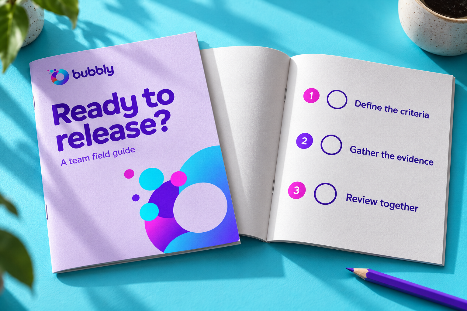
01Define your criteriaAgree what the team needs to know.
02Gather the evidenceBring the relevant release information into view.
03Review togetherMake the next question clear.
People in the picture.
The original folio’s illustration language puts people alongside systems and software. Its purple palette and rounded forms give the wider identity a friendly, connected character.


A technical brand.
A human community.
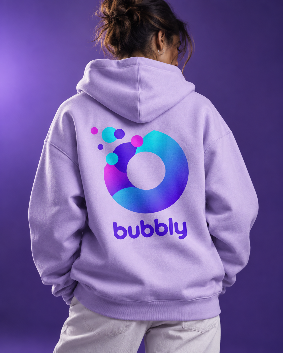
A generous back print gives the bubble its own presence. The same identity becomes a flexible editorial voice in a feed, with room for questions, explanations and shared ideas.
An idea worth discussing
Put the conversation
on the table.
A compact field guide brings the release-readiness idea into a team workshop. A simple sequence gives the brand a useful role away from a screen.

Branding for developer tools
Give a technical idea
a recognisable voice.
Phable helps technology teams turn a complex proposition into an identity that works across product, content and community.
Discuss your developer brand →What did Phable create for Bubbly?
Phable worked with Verifa on a branding workshop and assessment, explored logo directions and refined Bubbly’s distinctive logo and visual identity.
What makes developer tool branding useful?
A clear explanation of the idea, a recognisable identity and a consistent experience across the places developers encounter it. The tone should feel approachable while respecting the detail.
Explore our technology branding work.
Original identity and supplied illustration artwork: Phable’s Bubbly portfolio. Typography, motion, physical applications, documentation, interface, social and icon examples are new brand extension concepts. Screen designs are nonfunctional, with illustrative example data. Generated clothing, desk, publication and meetup images do not document manufactured products, actual staff or events. Bubbly’s original repository is archived; this page describes the historical branding project.